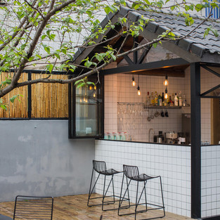
This beautiful interior design masterclass is the Qiyun Boutique Hotel as refurbished by Quanwen Interior Design last year.
(Full project details can be found here courtesy of Arch Daily: https://www.archdaily.com/897680/qiyun-boutique-hotel-quanwen-interior-design)
This is such an excellent example of how to balance feature and functional lighting, as well as adept use of light and dark tones and natural woods. So good in fact that I felt it warranted full examination.
Let's start with the lighting - The lighting plays a huge part in creating the welcoming atmosphere in this property. The spotlights and down lights are providing the general sense of bright and airiness here, but the subtle use of dark light really gives the ambience something special.
The term dark light (for the non lighting boffins) refers to light that is coming from a concealed source.

Here it is used in an open plan room in conjunction with the beams to create the Bedroom zone in the space. The result is subtle but striking and certainly adds to the inviting feel.
Dark light is also used behind mirrors and under beds in some rooms, producing the floating bed effect, as well as inside a recess in the dining room creating the highlighted circle that frames the bonsai. This quite simply adds a touch of magic to the dining space by modestly attracting attention to the feature tree.
The most noticeable examples of feature lighting vary between industrial and modern.

The industrial styled lighting is aptly used in functional areas like the kitchens. This creates instant character in areas that can appear stark and uninteresting when not thoroughly considered.

This fun seating area (loving the contrast colour buttons!) is in the same bedroom pictured above. Here again the lighting is use to help create zones within the space. The modern geometric feature pendant hangs low in the space over the coffee table, providing a pivotal point around which the seating area is arranged.

I am also a huge fan of the moon-like orb lights used in some of the bedrooms. Perfect mood setters when it's time to cosy up in bed.
Now lets talk about the use of light and dark here:

Dark colours are said to feel cosy, comforting and womb-like. Black is always a very dramatic colour to work with, because one of the key aspects it brings to the table is contrast.
The contrast of the black walls against the white walls here is used to create a trick of perspective. Because the apex roof is sloping down to the side wall the window itself is very short. It is made to appear bigger by the dramatic contrast in tones allowing you to imaging that the window could be full height, but is further away than it is in reality.
Most colours when well lit stand out and show off against a dark background.
Our eyes are not drawn to dark colours, so therefore anything you put in front of them will attract your focus. See how the bed appears to float here as the dark colour behind recedes.
And finally a look at the use of natural wood:

Wood is used in this property as one of the dominant colours, to create texture and to add a cosy, welcoming feel. The character woods can bring to a design is quite remarkable. In this case light-mid tone woods are used throughout as is common in Scandinavian/Nordic schemes, which is essentially what this is despite elements of Mid Century Modern and Wabi Sabi. The natural element also helps to keep this thoroughly though out design from feeling contrived.
All in all an absolutely stunning example of perfectly executed harmonious design.


Comments